A step by step guide teaching you how to build an AI-driven image editor, which lets users modify images by writing prompts

Here is a fun guide for you AI lovers out there. Today we will be building an image editor powered by OpenAI's DALL-E 2 model. It will let users upload photos, select areas and edit them by writing prompts. As a bonus, the app comes with user accounts and is ready to accept payments with Stripe subscriptions. All the code is open source and available on github so go wild with it!
What we'll be doing today:
- Set up a base application with Next.js
- Build an image editing UI with the help of react-advanced-cropper
- Communication with the DALL-E image generation api.
- Use Reflow for user accounts and subscriptions.
Setting Up the Project
The easiest way to get started with Next.js is by using create-next-app. This CLI tool enables you to quickly start building a new Next.js application, with everything set up for you.
$ npx create-next-app@latest
We will be using the DALL-E API to create image edits, so if you don't already have an OpenAI API key, you will have to create one.
Let's create a .env.local file and paste our key inside. We will use this later to authorize our API requests.
.env.local
OPENAI_KEY="sk-openAiKey"
Creating the Image Editor
Let's get started by creating a new component ImageEditor and adding it to our home page. We'll mark it as a client component with "use client" as we will be using browser APIs later on.
"use client";

import { useState } from "react";

export default function ImageEditor() {
  const [src, setSrc] = useState("");

  return <div>{src && <img src={src} />}</div>;
}
We'll import the ImageEditor in app/page.tsx.
import ImageEditor from "@/components/ImageEditor";

export default function Home() {
  return <ImageEditor />;
}
We will need a new component (Navigation) to house our editing tools, including the upload/download buttons, and later, the edit generation form.
To implement the upload/download buttons, we'll use react-icons, so let's go ahead and install that first:
$ npm install react-icons
"use client";

import { useRef } from "react";
import { FiUpload, FiDownload } from "react-icons/fi";

import IconButton from "@/components/icons/IconButton";

interface Props {
  onUpload?: (blob: string) => void;
  onDownload?: () => void;
}

export default function Navigation({ onUpload, onDownload }: Props) {
  const inputRef = useRef<HTMLInputElement>(null);

  const onUploadButtonClick = () => {
    inputRef.current?.click();
  };

  const onLoadImage = (event: React.ChangeEvent<HTMLInputElement>) => {
    const { files } = event.target;

    if (files && files[0]) {
      if (onUpload) {
        onUpload(URL.createObjectURL(files[0]));
      }
    }

    event.target.value = "";
  };

  return (
    <div className="flex justify-between bg-slate-900 p-5">
      <IconButton title="Upload image" onClick={onUploadButtonClick}>
        <FiUpload />
        <input
          ref={inputRef}
          type="file"
          accept="image/*"
          onChange={onLoadImage}
          className="hidden"
        />
      </IconButton>

      <IconButton title="Download image" onClick={onDownload}>
        <FiDownload />
      </IconButton>
    </div>
  );
}
src/components/icons/IconButton.tsx
import { ReactNode } from "react";

interface Props {
  onClick?: () => void;
  active?: boolean;
  disabled?: boolean;
  title?: string;
  children: ReactNode;
}

export default function IconButton({
  onClick,
  active,
  disabled,
  title,
  children,
}: Props) {
  return (
    <button
      className={`w-[46px] h-[46px] flex items-center justify-center hover:bg-slate-300/10 rounded-full ${
        active ? "text-sky-300 bg-slate-300/10" : "text-slate-300"
      }`}
      title={title}
      disabled={disabled}
      onClick={onClick}
    >
      {children}
    </button>
  );
}
Next, we'll add the Navigation to ImageEditor and add the basic upload and download functionality.
export default function ImageEditor() {
  const [src, setSrc] = useState('');

  const onUpload = (objectUrl: string) => {
    setSrc(objectUrl);
  };

  const onDownload = async () => {
    if (src) {
      downloadImage(src);
    }
  };

  const downloadImage = (objectUrl: string) => {
    const linkElement = document.createElement("a");
    linkElement.download = "image.png";
    linkElement.href = objectUrl;
    linkElement.click();
  };

 return (
    <div>
      {src && <img src={src}>}
      <Navigation
        onUpload={onUpload}
        onDownload={onDownload}
      />
    </div>
  );
}
Now we can start our application and open localhost:3000:
$ npm run dev
Not very exciting as of now, but we can upload an image and download the same image back to our computer. It's a start.
Generating Image Edits
In order to generate an image edit with DALL-E, we need to make a request to their API - https://api.openai.com/v1/images/edits. We need to send the following:
-
image - The image to edit. Must be a valid PNG file, less than 4MB, and square. If mask is not provided, image must have transparency, which will be used as the mask.
-
prompt - A text description of the desired image(s). The maximum length is 1000 characters.
-
mask - An additional image whose fully transparent areas (e.g. where alpha is zero) indicate where image should be edited. Must be a valid PNG file, less than 4MB, and have the same dimensions as image.
Handling Requests
When making a request to the DALL-E API we need to include our OpenAI API key for authorization. To prevent exposing our API key to the client, those requests must be handled on the server side. Let's set up a route handler in src/app/images/edit and utilize the environment variable OPENAI_KEY we added earlier for this purpose.
export async function POST(request: Request) {
  const apiKey = process.env.OPENAI_KEY;
  const formData = await request.formData();

  const res = await fetch("https://api.openai.com/v1/images/edits", {
    method: "POST",
    headers: {
      Authorization: `Bearer ${apiKey}`,
    },
    body: formData,
  });

  const data = await res.json();
  return Response.json(data);
}
Now we can make a request to our own internal API route /images/edit from our app without handling sensitive information on the client side.
Cropping Images
We will get back to the image generation in a bit. However, at this stage, we still don't have a way for users to create an image mask or write their prompts. We will address the masking first. There are a few ways we could do this:
- Draw the image on a canvas and implement an eraser tool so the user can delete the parts of the image they wish to be recreated.
- Add a selection tool that lets the user draw a selection over a region of the image that we should then erase.
We need to keep in mind that DALL-E expects us to provide a square image, too. That means that if the user uploads a rectangular image, we need to provide a way for them to crop it to their desired size. We can kill two birds with one stone by using react-advanced-cropper. It will provide the cropping functionality out of the box, and we can also use their selection in order to create a mask. Let's install it:
$ npm install react-advanced-cropper
We can now add the cropper to our ImageEditor. We will add a state variable for mode (crop/generate). When we upload a new image, the editor will enter "crop" mode. After the user crops the image, we will proceed to "generate" mode where we will let the user make a selection and enter their prompt.
"use client";

import { useState, useRef } from "react";

import {
  FixedCropperRef,
  FixedCropper,
  ImageRestriction,
} from "react-advanced-cropper";
import "react-advanced-cropper/dist/style.css";

import Navigation from "@/components/Navigation";

export default function ImageEditor() {
  const cropperRef = useRef<FixedCropperRef>(null);

  const [src, setSrc] = useState("");
  const [mode, setMode] = useState("crop");

  const isGenerating = mode === "generate";

  const crop = async () => {
    const imageSrc = await getCroppedImageSrc();

    if (imageSrc) {
      setSrc(imageSrc);
      setMode("generate");
    }
  };

  const onUpload = (imageSrc: string) => {
    setSrc(imageSrc);
    setMode("crop");
  };

  const onDownload = async () => {
    if (isGenerating) {
      downloadImage(src);
      return;
    }

    const imageSrc = await getCroppedImageSrc();

    if (imageSrc) {
      downloadImage(imageSrc);
    }
  };

  const downloadImage = (objectUrl: string) => {
    const linkElement = document.createElement("a");
    linkElement.download = "image.png";
    linkElement.href = objectUrl;
    linkElement.click();
  };

  const getCroppedImageSrc = async () => {
    if (!cropperRef.current) return;

    const canvas = cropperRef.current.getCanvas({
      height: 1024,
      width: 1024,
    });

    if (!canvas) return;

    const blob = (await getCanvasData(canvas)) as Blob;

    return blob ? URL.createObjectURL(blob) : null;
  };

  const getCanvasData = async (canvas: HTMLCanvasElement | null) => {
    return new Promise((resolve, reject) => {
      canvas?.toBlob(resolve);
    });
  };

  return (
    <div className="w-full bg-slate-950 rounded-lg overflow-hidden">
      {isGenerating ? (
        <img src={src} />
      ) : (
        <FixedCropper
          src={src}
          ref={cropperRef}
          className={"h-[600px]"}
          stencilProps={{
            movable: false,
            resizable: false,
            lines: false,
            handlers: false,
          }}
          stencilSize={{
            width: 600,
            height: 600,
          }}
          imageRestriction={ImageRestriction.stencil}
        />
      )}
      <Navigation
        mode={mode}
        onUpload={onUpload}
        onDownload={onDownload}
        onCrop={crop}
      />
    </div>
  );
}
The FixedCropper that react-fixed-cropper provides will handle the image cropping for us. We can utilize cropperRef to access the getCanvas() function which returns an HTML canvas element with the cropped image. We will add a Crop button to our Navigation. When the user clicks it we will read the result from the canvas, update the state of our src and switch to "generate" mode.
return (
  <div className="flex justify-between bg-slate-900 p-5">
    <IconButton title="Upload image" onClick={onUploadButtonClick}>
      <FiUpload />
      <input
        ref={inputRef}
        type="file"
        accept="image/*"
        onChange={onLoadImage}
        className="hidden"
      />
    </IconButton>
    <div className="flex grow items-center justify-center gap-2 mx-20">
      {mode === "crop" && <Button onClick={onCrop}>Crop</Button>}
    </div>
    <IconButton title="Download image" onClick={onDownload}>
      <FiDownload />
    </IconButton>
  </div>
);
Here's what the result looks like:

Masking Images
With the cropping taken care of, we can proceed to the masking step. We will use the standard Cropper from react-advanced-cropper. Let's create a new component ImageSelector.
"use client";

import {
  Cropper,
  CropperRef,
  Coordinates,
  ImageSize,
} from "react-advanced-cropper";

interface Props {
  src: string;
  selectionRect?: Coordinates | null;
  onSelectionChange: (cropper: CropperRef) => void;
}

export default function ImageSelector({
  src,
  selectionRect,
  onSelectionChange,
}: Props) {
  const defaultCoordinates = ({ imageSize }: { imageSize: ImageSize }) => {
    return (
      selectionRect || {
        top: imageSize.width * 0.1,
        left: imageSize.width * 0.1,
        width: imageSize.width * 0.8,
        height: imageSize.height * 0.8,
      }
    );
  };

  return (
    <Cropper
      src={src}
      className={"h-[600px]"}
      stencilProps={{
        overlayClassName: "cropper-overlay",
      }}
      backgroundWrapperProps={{
        scaleImage: false,
        moveImage: false,
      }}
      defaultCoordinates={defaultCoordinates}
      onChange={onSelectionChange}
    />
  );
}
The selector is pretty straightforward. We pass it the image URL, a function that will store the coordinates - onSelectionChange and the object that stores the coordinates - selectionRect. We will use these coordinates to create the image mask.
Let's replace the <img/> in our ImageEditor with the newly created ImageSelector and implement selectionRect and onSelectionChange.
const [selectionRect, setSelectionRect] = useState<Coordinates | null>();

const onSelectionChange = (cropper: CropperRef) => {
  setSelectionRect(cropper.getCoordinates());
};
...

return (
  ...
  {isGenerating ? (
    <ImageSelector
      src={src}
      selectionRect={selectionRect}
      onSelectionChange={onSelectionChange}
    />
  ) : (
    <FixedCropper ... />
  )}
  ...
)
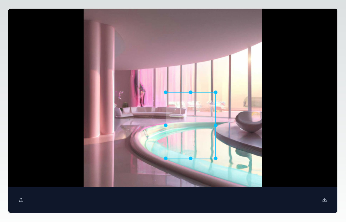
We can now easily select a part of the image.
Now we just need to handle creating the image and mask we will be sending to DALL-E. We already have the cropped image in our src so we just need to draw it on a canvas and convert it to a Blob. As for the mask, we need to set the canvas' 2D context's globalCompositeOperation property to "destination-out" and then draw the selection rectangle on top of the image.
const getImageData = async () => {
  if (!src) return;

  const canvas = document.createElement("canvas");
  await drawImage(canvas, src);

  return getCanvasData(canvas);
};

const getMaskData = async () => {
  if (!src || !selectionRect) return;

  const canvas = document.createElement("canvas");

  await drawImage(canvas, src);
  drawMask(canvas, selectionRect);

  return getCanvasData(canvas);
};

const drawImage = (canvas: HTMLCanvasElement | null, src: string) => {
  const context = canvas?.getContext("2d");

  if (!canvas || !context) return;

  return new Promise((resolve, reject) => {
    const img = new Image();
    img.crossOrigin = "anonymous";

    img.onload = () => {
      const width = img.width;
      const height = img.height;

      canvas.width = width;
      canvas.height = height;

      context.drawImage(img, 0, 0, width, height);

      resolve(context);
    };

    img.src = src;
  });
};

const drawMask = (
  canvas: HTMLCanvasElement | null,
  rect: Coordinates | null
) => {
  const context = canvas?.getContext("2d");

  if (!context || !rect) return;

  context.globalCompositeOperation = "destination-out";
  context.fillRect(rect.left, rect.top, rect.width, rect.height);
};
Handling Prompts
We are almost ready. The only thing left to do is add a way for users to write their prompts. We'll implement a straightforward form featuring an input field and a button. This form will enable users to provide their prompt, which we will then send to the DALL-E API to generate an image edit.
"use client";

import { useState } from "react";
import Input from "@/components/Input";
import Button from "@/components/Button";

interface Props {
  getImageData: () => Promise<any>;
  getMaskData: () => Promise<any>;
  onGenerate?: (blob: Blob, prompt: string) => void;
}

export default function GenerateImage({
  getImageData,
  getMaskData,
  onGenerate,
}: Props) {
  const [prompt, setPrompt] = useState("");

  const canGenerate = !!prompt;

  const onPromptChange = (e: React.ChangeEvent<HTMLInputElement>) => {
    setPrompt(e.target.value);
  };

  const generate = async () => {};

  return (
    <div className="flex flex-col md:flex-row gap-2">
      <Input type="text" onChange={onPromptChange} />
      <Button disabled={!canGenerate} onClick={generate}>
        Generate
      </Button>
    </div>
  );
}
src/components/Input.tsx
"use client";

interface InputProps {
  type?: string;
  onChange: (event: React.ChangeEvent<HTMLInputElement>) => void;
}

export default function Input({ type = "text", onChange }: InputProps) {
  return (
    <input
      type={type}
      onChange={onChange}
      className="bg-transparent border border-gray-300 text-slate-300 rounded-lg min-w-0 px-5 py-2.5"
    />
  );
}
src/components/Button.tsx
import { ReactNode } from "react";

interface ButtonProps {
  onClick: () => void;
  disabled?: boolean;
  children: ReactNode;
}

export default function Button({
  onClick,
  disabled = false,
  children,
}: ButtonProps) {
  return (
    <button
      className="text-gray-900 bg-white border border-gray-300 disabled:bg-gray-300 focus:outline-none enabled:hover:bg-gray-100
  focus:ring-4 focus:ring-gray-200 font-medium rounded-lg text-sm px-5 py-2.5
  dark:bg-gray-800 dark:text-white dark:border-gray-600 dark:enabled:hover:bg-gray-700 dark:enabled:hover:border-gray-600
  dark:focus:ring-gray-700"
      disabled={disabled}
      onClick={() => onClick()}
    >
      {children}
    </button>
  );
}
Let's add our form to the Navigation:
return (
  <div className="flex justify-between bg-slate-900 p-5">
    <IconButton title="Upload image" onClick={onUploadButtonClick}>
      <FiUpload />
      <input
        ref={inputRef}
        type="file"
        accept="image/*"
        onChange={onLoadImage}
        className="hidden"
      />
    </IconButton>
    <div className="flex grow items-center justify-center gap-2 mx-20">
      {mode === "crop" && <Button onClick={onCrop}>Crop</Button>}
      {mode === "generate" && (
        <GenerateImage
          getImageData={getImageData}
          getMaskData={getMaskData}
          onGenerate={onGenerateImage}
        />
      )}
    </div>
    <IconButton title="Download image" onClick={onDownload}>
      <FiDownload />
    </IconButton>
  </div>
);
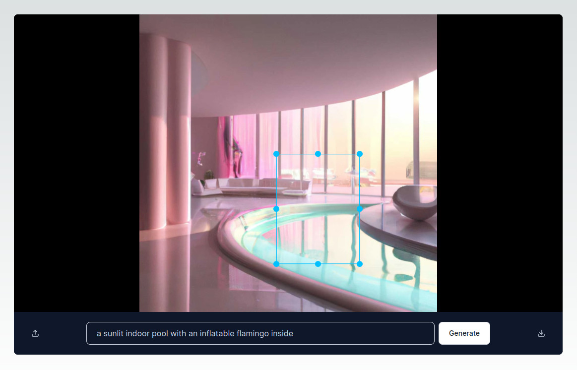
Now we can use this form to enter a prompt for the image edit.
Generating Edits
Now, we can implement the generate functionality in GenerateImage. We'll make a request to our internal API route /images/edit and pass it the image, mask and prompt. In order to send the images, we need to use a formData object. We will get the original image and our image mask from ImageEditor by calling getImageData and getMaskData respectively. The only other data we need to add is the prompt that the user has entered.
const generate = async () => {
  const image = (await getImageData()) as Blob;
  const mask = (await getMaskData()) as Blob;

  if (!image || !mask) return;

  const formData = new FormData();

  formData.append("image", image);
  formData.append("mask", mask);
  formData.append("prompt", prompt);
  formData.append("response_format", "b64_json");

  let result, response;

  try {
    response = await fetch("/images/edit", {
      method: "POST",
      body: formData,
    });

    result = await response.json();

    if (result.error) {
      throw new Error(result.error.message);
    }

    const imageData = result.data[0].b64_json;
    const blob = dataURLToBlob(imageData, "image/png");

    if (onGenerate) {
      onGenerate(blob, prompt);
    }
  } catch (e) {}

  const dataURLToBlob = (dataURL: string, type: string) => {
    var binary = atob((dataURL || "").trim());
    var array = new Array(binary.length);

    for (let i = 0; i < binary.length; i++) {
      array[i] = binary.charCodeAt(i);
    }

    return new Blob([new Uint8Array(array)], { type });
  };
};
If the image edit is created successfully we will call the onGenerate function from ImageEditor to update the state of our src. The selection will be preserved and the user can create another edit if they wish.
const onGenerate = (imageSrc: string, prompt: string) => {
  setSrc(imageSrc);
};
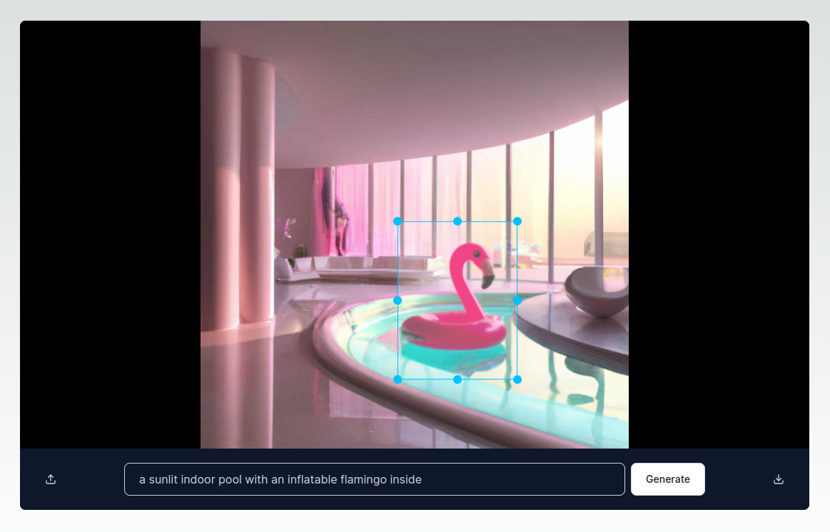
Let's try generating an image edit. You can see DALL-E has drawn an inflatable flamingo inside our selection and hasn't touched the other parts of the image.
Login & Subscriptions
Now that we've handled the image editing, we can move on to adding authentication. We want to restrict the access to the Image Editor so that only authenticated users with an active subscription can use it. Setting up the login functionality is a breeze with Reflow.
Login
First, we need to install the @reflowhq/auth-next library.
$ npm install @reflowhq/auth-next
Then, we need to create the following two files:
import "server-only";
import { ReflowAuth } from "@reflowhq/auth-next";

export default function getAuth(): ReflowAuth {
  return new ReflowAuth({
    projectID: parseInt(process.env.REFLOW_PROJECT_ID || ""),
    secret: process.env.REFLOW_SECRET || "",
    testMode: true,
  });
}
This file imports and initializes the Reflow library. We will be importing this file in our page in order to obtain a ReflowAuth instance.
We'll need to add the Reflow project ID and a 32 char string as environment variables in the .env.local file.
.env.local
...
REFLOW_PROJECT_ID="123456"
REFLOW_SECRET="32-char-string"
Add the ID of your Reflow project (you can find it in the project's dashboard page), and add a unique 32 character secret string. The latter is used for encrypting the session cookie.
You can generate a 32 char secret string with your password manager, or with a command like this (if you're on an unix-like OS):
openssl rand -hex 16
The second file we need to create is a route handler. It acts as the "glue" between the Reflow client functions and the server.
import getAuth from "@/auth";

export async function POST(request: Request) {
  const auth = getAuth();
  return await auth.handleRequest(request);
}
Now that we have done the necessary setup, we can easily add authentication to our app.
Let's add a login and logout button to our page and only show the image editor if the user is authenticated.
import getAuth from "@/auth";

import LoginButton from "@/components/LoginButton";
import LogoutButton from "@/components/LogoutButton";
import ImageEditor from "@/components/ImageEditor";

export default async function Home() {
  const auth = getAuth();
  const user = await auth.user();

  if (await auth.isSignedIn()) {
    return (
      <div className="w-full">
        <div className="flex flex-col md:flex-row justify-between items-center mb-10">
          <h1 className="text-xl font-semibold mb-2">Hello, {user?.name}</h1>
          <div className="flex gap-2">
            <LogoutButton />
          </div>
        </div>

        <ImageEditor />
      </div>
    );
  }

  return <LoginButton />;
}
The login/logout buttons are pretty straightforward. We just need to import signIn/signOut from @reflowhq/auth-next/client and call them in the buttons' onClick handlers.
"use client";

import { signIn } from "@reflowhq/auth-next/client";
import Button from "@/components/Button";

export default function LoginButton() {
  return (
    <Button onClick={() => signIn({ onSuccess: () => location.reload() })}>
      Sign in
    </Button>
  );
}
"use client";

import { signOut } from "@reflowhq/auth-next/client";
import Button from "@/components/Button";

export default function LogoutButton() {
  return (
    <Button onClick={() => signOut({ onSuccess: () => location.reload() })}>
      Sign out
    </Button>
  );
}
Subscriptions
We'll further restrict the access to the Image Editor by checking if the user is subscribed.
Prerequisits
We'll need to setup the subscriptions by connecting a payment provider in Reflow and creating subscriptions plans.
Once we've done that, we can retrieve the authenticated user's subscription plan info with auth.subscription() and render the editor conditionally:
import getAuth from "@/auth";

import LoginButton from "@/components/LoginButton";
import LogoutButton from "@/components/LogoutButton";
import ImageEditor from "@/components/ImageEditor";

export default async function Home() {
  const auth = getAuth();
  const user = await auth.user();

  if (await auth.isSignedIn()) {
    const sub = await auth.subscription();

    return (
      <div className="w-full">
        <div className="flex flex-col md:flex-row justify-between items-center mb-10">
          <h1 className="text-xl font-semibold mb-2">Hello, {user?.name}</h1>
          <div className="flex gap-2">
            <LogoutButton />
          </div>
        </div>
        {sub && <ImageEditor />}
      </div>
    );
  }

  return <LoginButton />;
}
Subscription Plans
Now we need to add a way for users to subscribe. We'll create a PlanList component that lists our project's subscription plans.
import Plan from "@/components/Plan";

type Plan = {
  id: number;
  name: string;
  features: [];
  prices: Price[];
};

type Price = {
  id: number;
  price: number;
  price_formatted: string;
  billing_period: string;
};

export default function PlanList({ plans }: { plans: Plan[] }) {
  return (
    <div className="flex gap-2">
      {plans.map((plan: Plan) => (
        <Plan
          key={plan.id}
          name={plan.name}
          features={plan.features}
          price={plan.prices[0].price_formatted}
          billingPeriod={plan.prices[0].billing_period}
          subscriptionID={plan.prices[0].id}
        />
      ))}
    </div>
  );
}
"use client";

import { createSubscription } from "@reflowhq/auth-next/client";
import { FaCircleCheck } from "react-icons/fa6";

type Plan = {
  name: string;
  features: [];
  price: string;
  billingPeriod: string;
  subscriptionID: number;
};

export default function Plan({
  name,
  features,
  price,
  billingPeriod,
  subscriptionID,
}: Plan) {
  return (
    <div className="w-full max-w-sm p-4 bg-white border border-gray-200 rounded-lg shadow sm:p-8">
      <h5 className="mb-4 text-xl font-medium text-gray-500">{name}</h5>
      <div className="flex items-baseline text-gray-900">
        <span className="text-4xl font-extrabold tracking-tight">{price}</span>
        <span className="ms-1 text-xl font-normal text-gray-500">
          /{billingPeriod}
        </span>
      </div>
      <ul role="list" className="space-y-5 my-7">
        {features.map((feature, index) => (
          <li key={index} className="flex items-center">
            <FaCircleCheck size={20} color="#2563eb" />
            <span className="text-base font-normal leading-tight text-gray-500 ms-3">
              {feature}
            </span>
          </li>
        ))}
      </ul>
      <button
        type="button"
        className="text-white bg-blue-600 hover:bg-blue-700 focus:ring-4 focus:outline-none focus:ring-blue-200 font-medium rounded-lg text-sm px-5 py-2.5 inline-flex justify-center w-full text-center"
        onClick={() => {
          createSubscription({
            priceID: subscriptionID,
            onSuccess: () => location.reload(),
          });
        }}
      >
        Subscribe
      </button>
    </div>
  );
}
The Plan component renders a card listing the subscription plan name, price and features, as well as a Subscribe button. One thing to note here is that this has to be a client component because we are using createSubscription from @reflowhq/auth-next/client. When the Subscribe button is clicked, the user will see a pop-up window where they will need to enter their payment details.
You can test the subscriptions by using one of the test cards that Stripe provides.
Now we can add the PlanList to our page. We'll retrieve the subscription plans from the Reflow API and pass them as a parameter to our PlanList component.
import getAuth from "@/auth";

import LoginButton from "@/components/LoginButton";
import LogoutButton from "@/components/LogoutButton";
import ImageEditor from "@/components/ImageEditor";
import PlanList from "@/components/PlanList";

export default async function Home() {
  const auth = getAuth();
  const user = await auth.user();

  async function getPlans() {
    "use server";
    const res = await fetch(
      `${auth.apiBase}/projects/${auth.projectID}/plans/`
    );
    return res.json();
  }

  if (await auth.isSignedIn()) {
    const sub = await auth.subscription();
    const plans = await getPlans();

    return (
      <div className="w-full">
        <div className="flex flex-col md:flex-row justify-between items-center mb-10">
          <h1 className="text-xl font-semibold mb-2">Hello, {user?.name}</h1>
          <div className="flex gap-2">
            <LogoutButton />
          </div>
        </div>
        {sub ? <ImageEditor /> : <PlanList plans={plans.data} />}
      </div>
    );
  }

  return <LoginButton />;
}
Subscription Parameters
Subscription plans can have different features and parameters depending on their tier. In this example, we've added two plans - Free and Premium. The Free plan subscribers will be allowed one image edit and the Premium - 5. In order to do this, we can add a parameter "edits" to both our plans with a value of 1 and 5 respectively. We can access the parameter from the subscription plan info:
const sub = await auth.subscription();
console.log(sub?.plan.parameters.edits);
Database Setup
In order to inforce this editing limit, we will have to store the edits somewhere. We can easily whip up a database with Prisma and SQLite.
Setting up Prisma
First, we need to install the prisma package:
$ npm install prisma --save-dev
Then, we will initialize it:
$ npx prisma init --datasource-provider sqlite
This will generate a schema.prisma and a .env file.
prisma/schema.prisma
generator client {
  provider = "prisma-client-js"
}

datasource db {
  provider = "sqlite"
  url = env("DATABASE_URL")
}
.env
DATABASE_URL="file:./dev.db"
Let's add a model for the edits we will store:
prisma/schema.prisma
...
model Edit {
  id String @id @default(uuid())
  prompt String
  userId String
}
The userId field will store the Reflow user ID so we can associate users with their edits.
Now we can migrate this change into our database:
$ npx prisma migrate dev --name init
This will create a migration file, as well as a couple of dev.db* files. We'll add those files and the .env file to our .gitignore as they shouldn't be committed.
.gitignore
...
.env
dev.db*
There is one more thing we need to do before we can start using Prisma in our project. First, we need to install the @prisma/client package:
$ npm install @prisma/client
Finally, we'll add a db.ts file in our src folder with the following code:
import { PrismaClient } from "@prisma/client";

const prismaClientSingleton = () => {
  return new PrismaClient();
};

declare global {
  var prisma: undefined | ReturnType<typeof prismaClientSingleton>;
}

const prisma = globalThis.prisma ?? prismaClientSingleton();

export default prisma;

if (process.env.NODE_ENV !== "production") globalThis.prisma = prisma;
This will instantiate a single instance PrismaClient and save it on the globalThis object. We need to do this as in development, the command next dev clears Node.js cache on run. This in turn initializes a new PrismaClient instance each time due to hot reloading that creates a connection to the database.
Storing Edits
Now we can use the PrismaClient instance exported from db.ts to access our database.
import getAuth from "@/auth";
import prisma from "@/db";

import LoginButton from "@/components/LoginButton";
import LogoutButton from "@/components/LogoutButton";
import ImageEditor from "@/components/ImageEditor";
import PlanList from "@/components/PlanList";

export default async function Home() {
  const auth = getAuth();
  const user = await auth.user();
  const userId = String(user?.id || "");

  async function getPlans() {
    "use server";
    const res = await fetch(
      `${auth.apiBase}/projects/${auth.projectID}/plans/`
    );
    return res.json();
  }

  async function createEdit(prompt: string) {
    "use server";
    await prisma.edit.create({ data: { prompt, userId } });
    revalidatePath("/");
  }

  if (await auth.isSignedIn()) {
    const sub = await auth.subscription();
    const plans = await getPlans();

    const editCount = sub ? await prisma.edit.count({ where: { userId } }) : 0;
    const canEditImages = sub?.plan.parameters.edits > editCount;

    return (
      <div className="w-full">
        <div className="flex flex-col md:flex-row justify-between items-center mb-10">
          <h1 className="text-xl font-semibold mb-2">Hello, {user?.name}</h1>
          <div className="flex gap-2">
            <LogoutButton />
          </div>
        </div>

        {sub ? (
          <ImageEditor
            canGenerateEdits={canEditImages}
            createEdit={createEdit}
          />
        ) : (
          <PlanList plans={plans.data} />
        )}
      </div>
    );
  }

  return <LoginButton />;
}
The createEdit function adds a new record to our edits table:
async function createEdit(prompt: string) {
  "use server";
  await prisma.edit.create({ data: { prompt, userId } });
  revalidatePath("/");
}
We've called revalidatePath("/") in order to invalidate the Next.js cache and make sure our page is up to date.
We need to call the createEdit function when a new edit is generated (in the onGenerate method) in order to store it in the database:
const onGenerate = (imageSrc: string, prompt: string) => {
  createEdit && createEdit(prompt);
  setSrc(imageSrc);
};
Now we can limit the number of edits a user can do by retrieving the number of edits associated with the current user and comparing them to the edits parameter of their subscription plan.
const editCount = sub ? await prisma.edit.count({ where: { userId } }) : 0;
const canEditImages = sub?.plan.parameters.edits > editCount;
We'll use canEditImages to conditionally render the GenerateImage form:
{
  mode === "generate" && (
    <>
      {canGenerateEdit ? (
        <GenerateImage
          getImageData={getImageData}
          getMaskData={getMaskData}
          onGenerate={onGenerateImage}
        />
      ) : (
        <p className="text-slate-400">
          Upgrade to another subscription plan to edit more images.
        </p>
      )}
    </>
  );
}
Now the form will not be shown if the user has exhausted all of their editing credits. But we need to add this logic to our route handler, too:
import { NextResponse } from "next/server";

import getAuth from "@/auth";
import prisma from "@/db";

export async function POST(request: Request) {
  const auth = getAuth();

  if (!(await auth.isSignedIn())) {
    return NextResponse.json({ error: "Unauthorized" }, { status: 401 });
  }

  const user = await auth.user();
  const userId = String(user?.id || "");

  const sub = await auth.subscription();

  const editCount = sub ? await prisma.edit.count({ where: { userId } }) : 0;
  const canEditImages = sub?.plan.parameters.edits > editCount;

  if (!canEditImages) {
    return NextResponse.json(
      { error: "Edit quota exceeded." },
      { status: 429 }
    );
  }

  const apiKey = process.env.OPENAI_KEY;
  const formData = await request.formData();

  const res = await fetch("https://api.openai.com/v1/images/edits", {
    method: "POST",
    headers: {
      Authorization: `Bearer ${apiKey}`,
    },
    body: formData,
  });

  const data = await res.json();
  return Response.json(data);
}
With this our AI driven image editor is ready! The code is MIT licensed and available on GitHub. We can't wait to see what you make with it!